We explore usability and utility through five major areas. Learnability, Efficiency, Memorability, Errors, and Satisfaction.

Learnability
How easy is it for users to accomplish basic tasks the first time they encounter them?

Efficiency
Once users have learned the design, how quickly can they perform the task?

Memorability
When users return after some time, how easy is it for them to reestablish proficiency?

Errors
How many errors are users making, how severe are they, and how easily can they recover from them?

Satisfaction
How pleasant is the design to use?
Usability Evaluation Criteria / Things to keep in mind when designing
1. Keep users informed about their status appropriately and promptly. (Always show status)

GOOD:
The J.Crew site displays a notification that there are “Only a Few Left!” when the user moves the mouse over low-stock sizes of a product. Some sizes are already sold out, and thus shown crossed out in light gray.

BAD:
The Paradise Drinking Water site lacks breadcrumbs to indicate the user’s location on the websites and no way for the user to move back and forth between the pages other than the main navigation bar.
2. Show information in ways users understand - how the real world operates and in the users' language. (Be human and talk like one)

GOOD: The Yummly website does an effective job using icons that reflect their real-world equivalents and terms that make sense to foodies of all levels.

BAD: The Seascanner site under cruise finder doesn’t speak the users' language, with words, phrases and concepts familiar to the user, rather sticks to system-oriented terms.
3. Offer users control and let them undo errors easily. (Give users the freedom to fix mistakes easily and quickly)
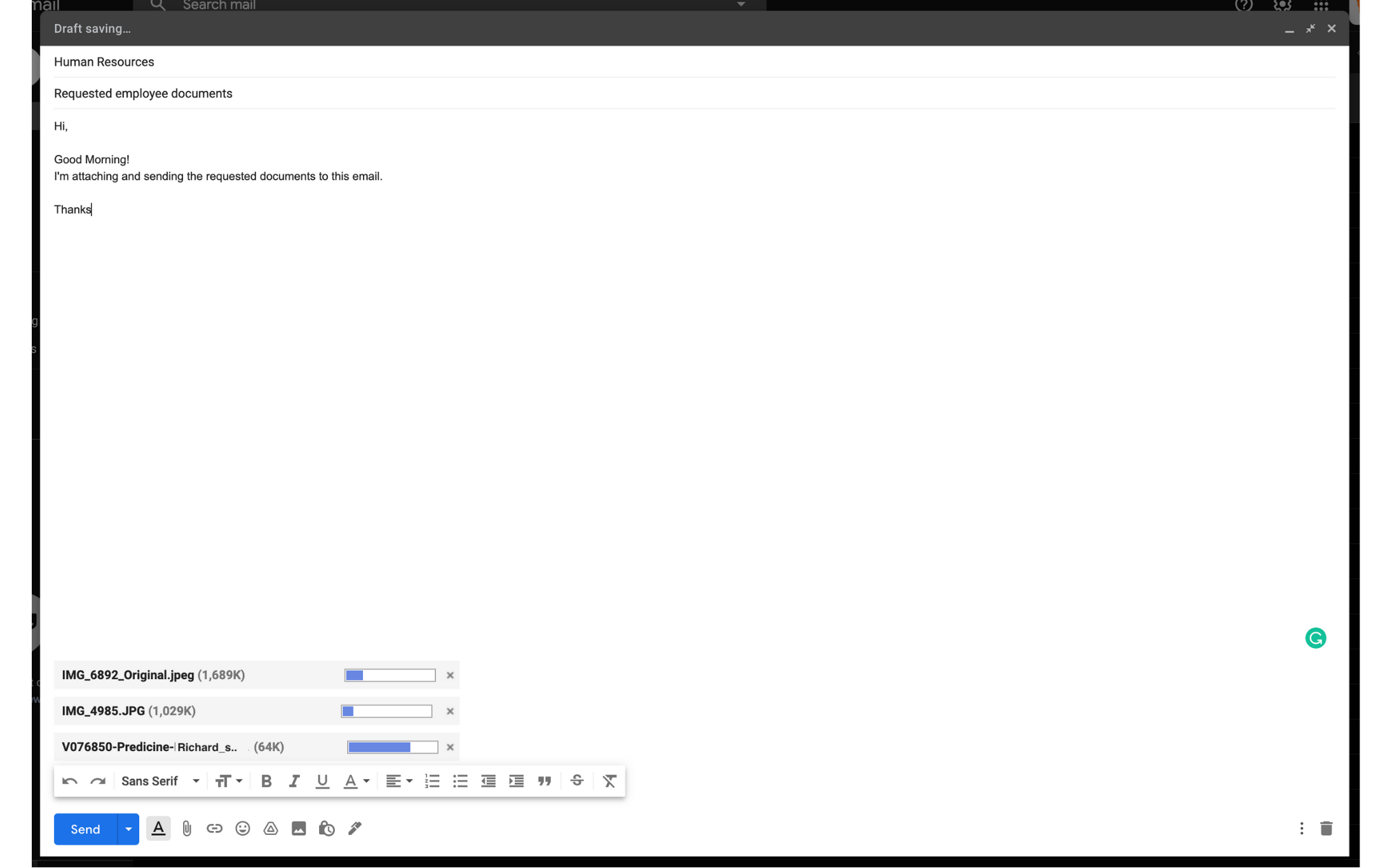
GOOD: In Gmail, if a user attaches a file
mistakenly, they have the option to cancel uploading before it's fully uploaded.
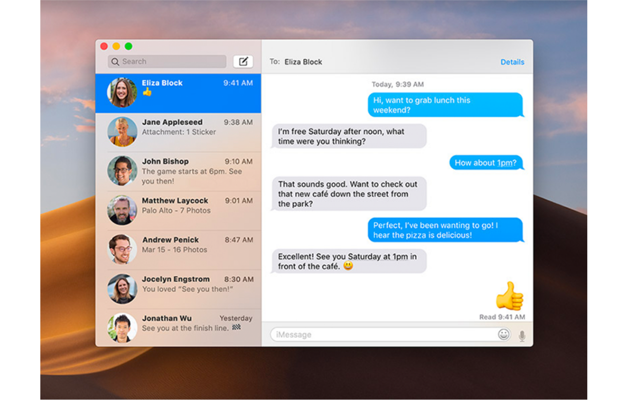
BAD: The iMessage app has no way for users
to recall a text message (a feature that other communication apps such as WhatsApp and Slack do provide).
4. Be consistent so users aren't confused over what different words, icons, etc., mean. (Set a standard and stick with it)
GOOD: Google uses conventional menu items
in its online applications. These menu labels and icons follow patterns of other competing and similar applications
to lessen the user’s need to learn something new.
BAD: Ling’s car is a unique website that
lacks familiarity with the well-established website conventions in terms of terminology, actions, layouts etc.
5. Prevent errors – a system should either avoid conditions where errors arise or warn users before they take risky actions. (Minimize human error)
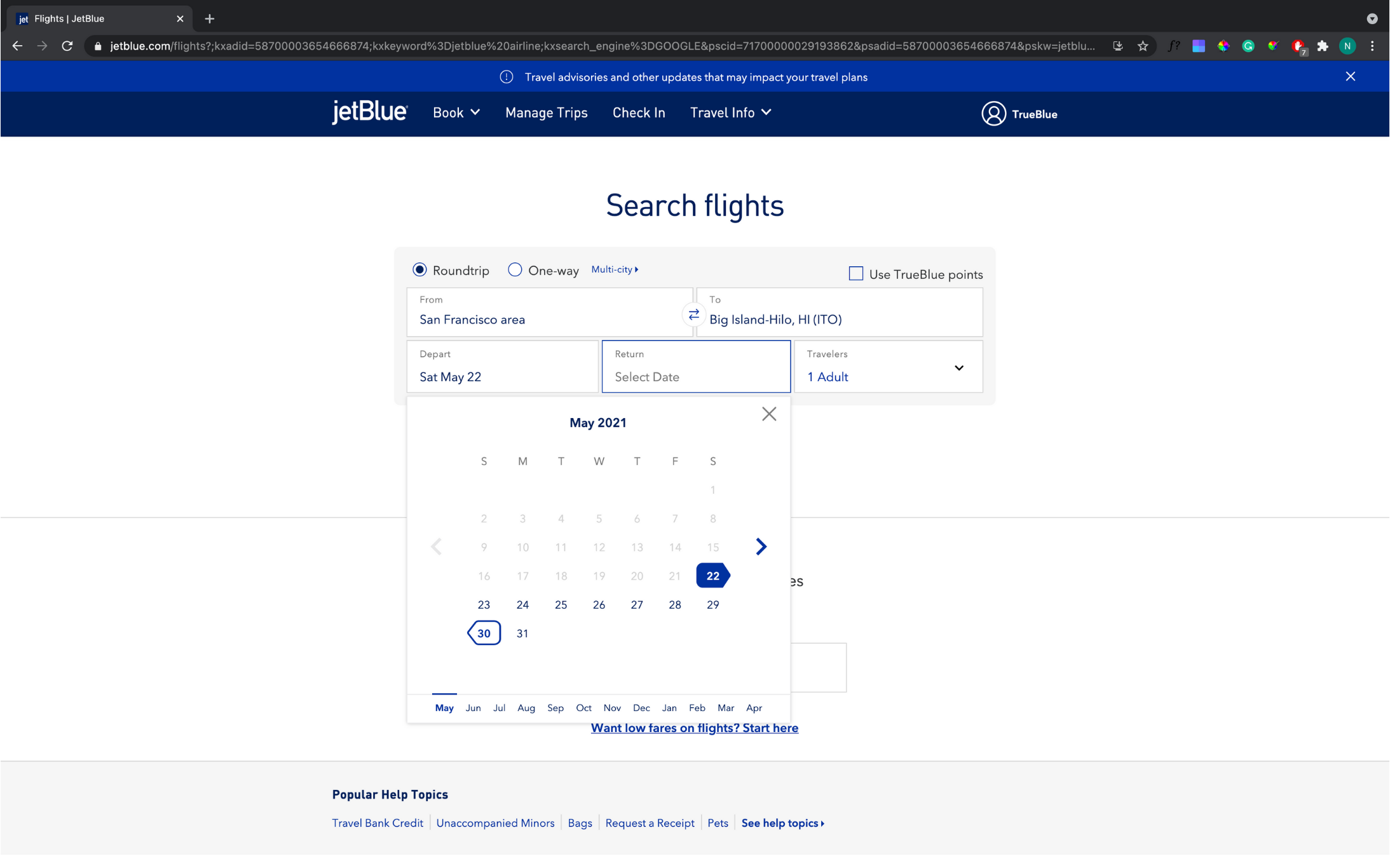
GOOD: When booking a plane ticket on
their website, JetBlue does not allow users to pick a return date that is before their departure date in order to
prevent users from accidentally choosing a date that is too early.
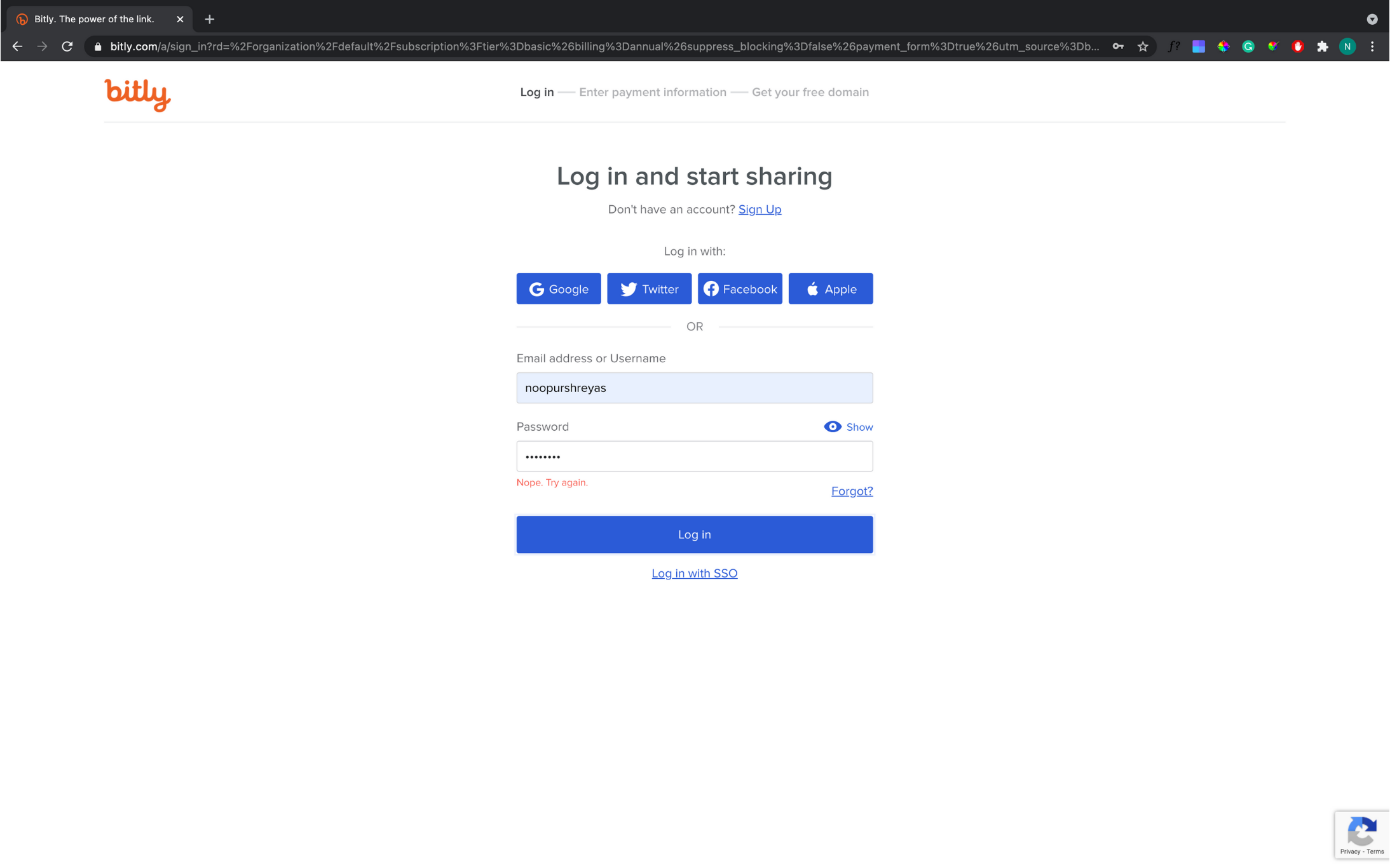
BAD: Bitly website isn’t demonstrating
error prevention by not telling me whether my email address/username or password was entered wrong or if I even have
an account to login.
6. Have visible information, instructions, etc., to let users recognize options, actions, etc., instead of forcing them to rely on memory. (Don't make me think)

GOOD: Google search typing suggestion is
an excellent example of contextual recommendations. As the user starts typing, Google Search suggests the relevant
query, and this helps users find the relevant query in less time.

BAD: On Yale University School of Art’s website, the content has absolutely no structure, and in addition, the
footer, header, and sidebar are poorly designed. Overall extremely hard for the user to navigate and find any
relevant information or actions.
7. Be flexible, so experienced users find faster ways to attain goals. (Optimize to the level of the current user)

GOOD: When one searches for a specific
animal on Google, it summarizes all the available resources/information into pre-refined categories to help user to
efficiently navigate and consume relevant information.

BAD: Craigslist is one of the most visited
websites but they have a link-based structure for the users to follow to check the necessary location-based
information and complete various actions but no shortcuts.
8. Have no clutter, containing only relevant information for current tasks. (Keep It Simple Stupid)

GOOD: The Apple website is an excellent
example of minimalism. Minimalistic products focus on content and remove all unnecessary visual design details. Many
pages of the website are centered around one particular product or idea, and this makes it easier to prioritize
information.

BAD: The Gates N Fences website is
extremely cluttered and contains a lot of irrelevant information and information that is likely not to be used
often, taking the focus off of the user’s main goal.
9. Provide plain-language help regarding errors and solutions. (Help users in clear language)

GOOD: On Hotels.com website the details
and payment form provides alerts of what is wrong and what needs to be done to recover. The fields with errors are
highlighted and itemized instructions are listed adjacently, void of error codes or technical jargon.
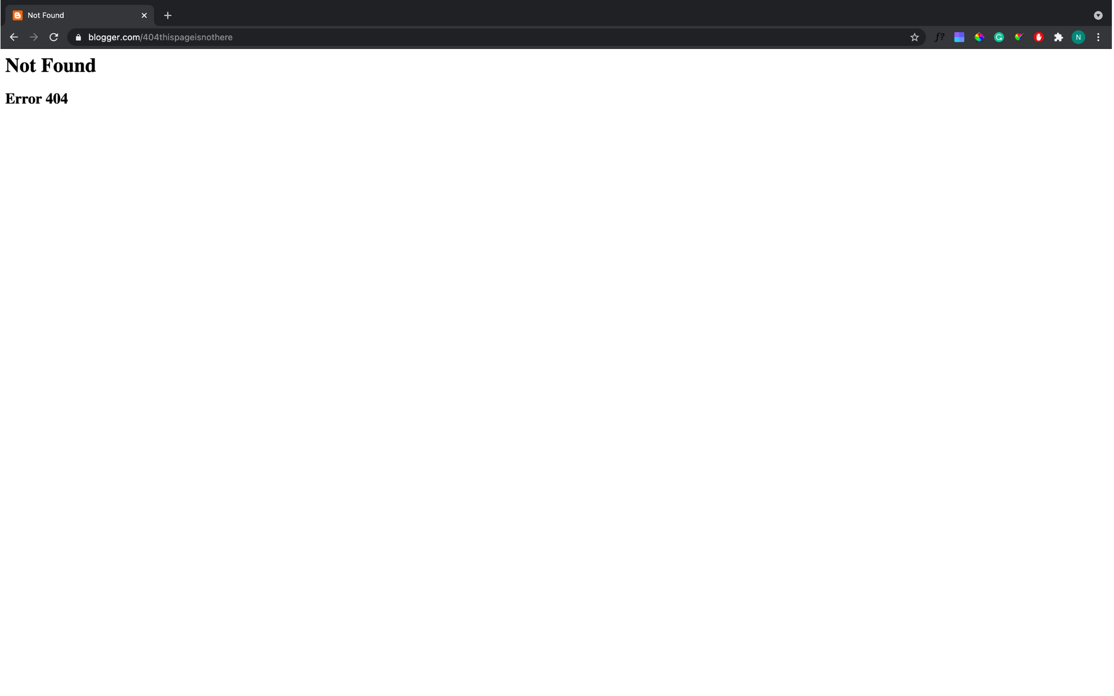
BAD: Blogger.com’s 404 error page does not
tell users anything about what went wrong or how they can fix it, which can easily confuse users.
10. List straightforward steps in lean, searchable documentation for overcoming problems. (A manual should not be required, but is there if needed)
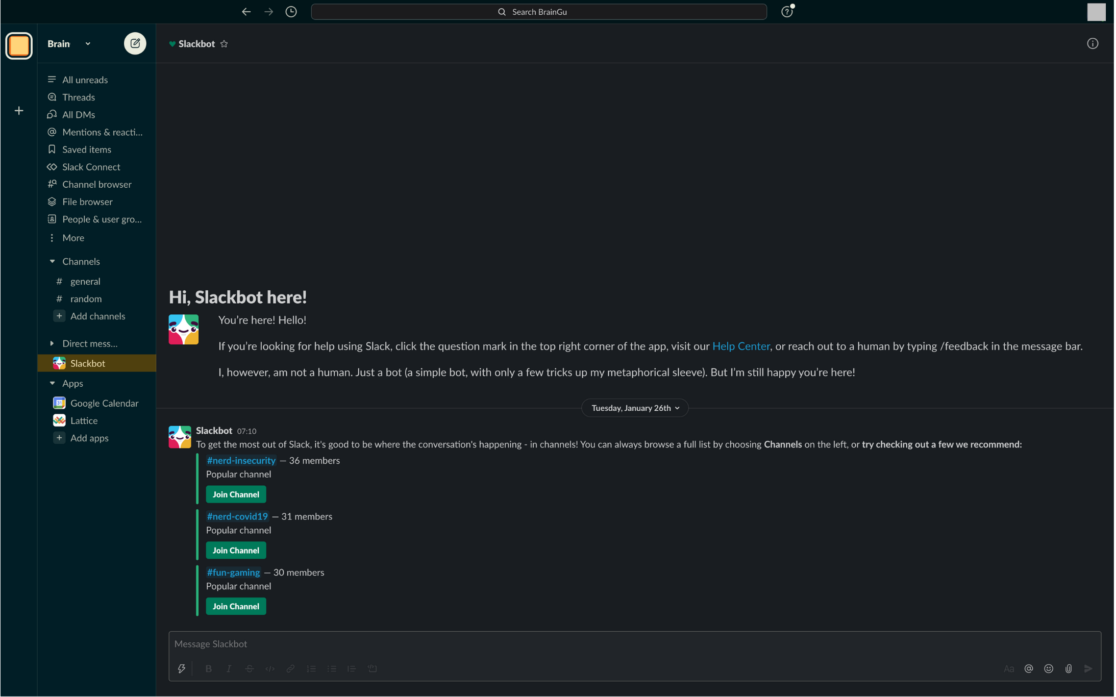
GOOD: Slack’s Slackbot offers users an
easy and readily accessible way of getting help. All users have to do is message the bot with their question and it
will help them by either answering it or providing the documentation necessary to answer their query.

BAD: Ling’s car website does not offer any
visible help or documentation, preventing users from being able to access help when they need it.

 The BrainG-UX Philosophy